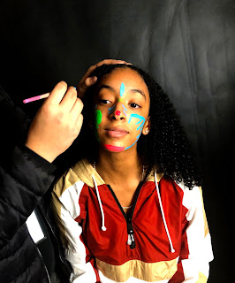
Color sampling
1.The second photo is the best shot in the project, Its well focused and it looks better with the edits.
2. The first photo is the weakest,the edits did not come out as i would have liked and it was hard to get them just right.
3. To make the photo better I would change up the distance i took the photo and make it clearer.
4. I used photo shop and changed the hue saturation edit it to black and white then black and white with tint and a layer mask.
5. Changing the color of the photo changes the mood and feel entirely, when the color is darker and and has a deeper depth to it it helps the color pop. Black and white just automatically makes you feel its a bit depressing.
6. Getting the set up done for this project was easy since we could do it in class as a group.
7. Doing the layer mask was kinda hard for this project, editing it with the tool was a struggle.
8. Id take more photos with different subjects and not only the couple I had id add some variety
9. Id say my effort was a 6 on this project i only have half of the needed contact sheet photos so id cut my effort in about half, but i still tried my best on the edits.


the colors are really nice but the photos you chose could've been better.
ReplyDelete